The site downloaded quickly, opening even the big banner graphic fast (I’m sure that’s something they thought about!). The ‘educationeye’ element of the page took a few seconds longer to fill with its content. All links seemed to work and pictures displayed fine. I didn’t come across any audio or video elements, which surprised me a little as I'm so used to seeing embedded video on educational resource sites these days.
The Futurelab web site includes a mini ‘educationeye’ on the front page, but I couldn’t understand why the content was arranged as it was. Education Eye offers “a way to discover and explore new ideas by mapping 100s of the top educational websites, blogs, forums and practitioner case studies.” The list view was obvious, but the ‘full’ view positioned items around the space using some metric I couldn’t fathom.
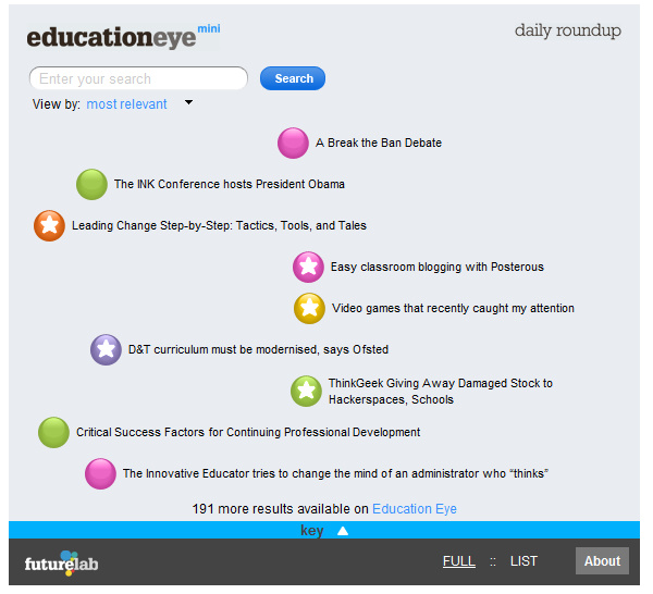
Clicking on the title took me to the full version of EducationEye (http://www.educationeye.org.uk/) which I found took quite a bit longer to load. It has a fancy interface which allows you to scroll around and view articles relating to innovation in education. I’ve been back to look at this site a few times as it feels like it ought to be a really useful site, but the interface gets in the way for me. I feel like I don’t know what I’m meant to do with it. There is the option to subscribe via RSS, which seems more attractive as I’d be able to scan the incoming feed headlines quickly, but I feel like I’m missing something and being incredibly dense and failing to appreciate whatever brilliant design they’ve come up with.
General
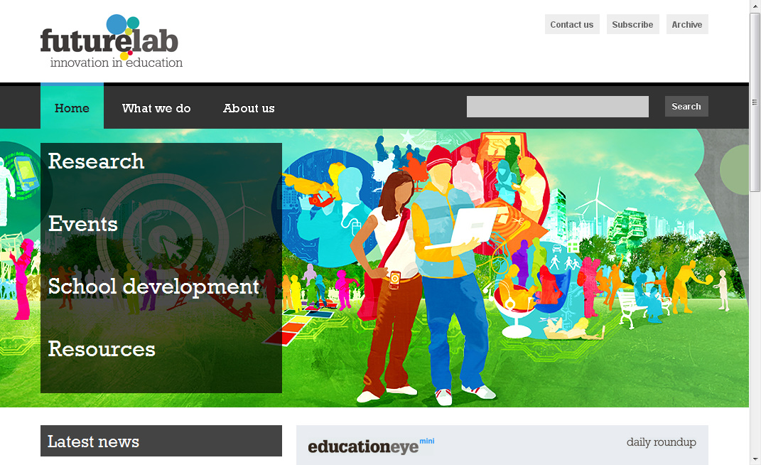
The site initially appears easy to navigate with the front page displaying a large menu of 4 aspects:
When you click on one of these, you get an expanded list:
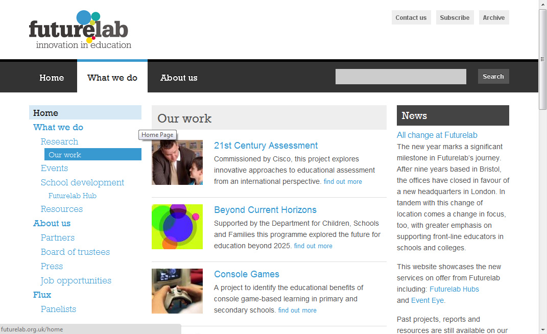
However, this annoyed me, as I wasn’t able to see the detail of what was under each menu item until I'd clicked on the front page link - and then waited for the page to re-draw. Maybe my broadband connection got busier while I was using the site, but it certainly took longer to load these pages than it had the home page.
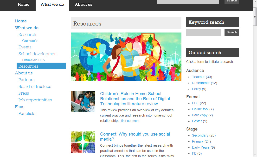
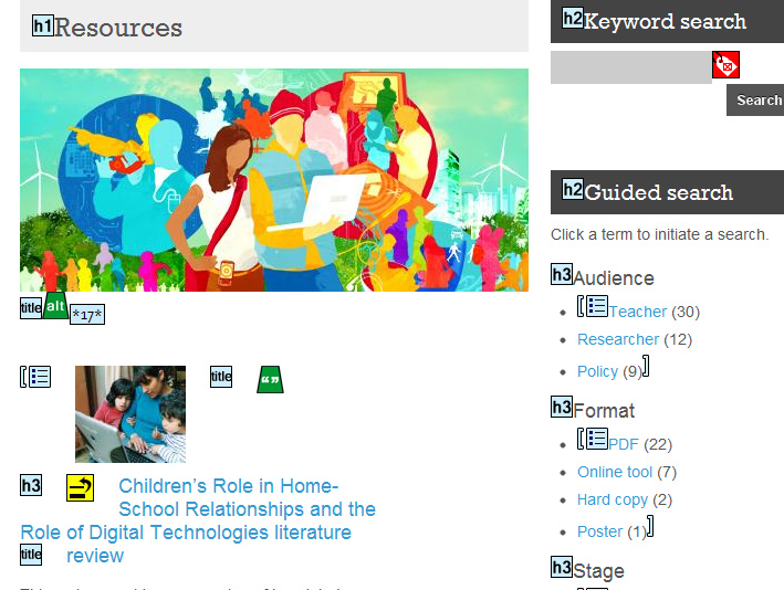
After quite a bit of fiddling, I found that the largest amount of useful looking content seemed to be on the Our Work and Resources pages. And then I discovered that the Resources page had a nice ‘Guided Search’ (effectively search by tag) feature... why wasn’t this on the home page?!
In terms of accessibility, I don’t know how a screen-reader would cope with this site. Perhaps the very simple top level of the menu would be easy for a screen-reader to interpret, but I don’t know how they work. I also don’t know how they work with Flash, but the interactivity provided by educationeye seems likely to pose problems for those with visual impairments.
I used the WAVE free web accessibility evaluation tool provided by WebAIM to check the site. WAVE doesn’t provide a complex technical report, but presents the original web page with overlayed icons and indicators that reveal the accessibility of that page. The outcome for Futurelab’s site seemed pretty favourable.
Academic
While this site deals with education, supporting teachers and providing resources, it is not intended to be a learning activity. Therefore, I didn’t really feel it was appropriate to evaluate in terms of pedagogical issues, learning design, sequencing, etc.
Context-specificGiven the intended audience, it might be argued that this site is designed for the technically confident, IT literate user, happy to use the tools available, knowledgable in search techniques, and able to easily recognise the web 2.0 features such as a blog and RSS feed. Conversely, the site could be intended to be for all those educators out there who really want to improve their innovative use of technology in learning, but who are nervous or lacking experience. I think that once they’ve found the Resources page they may be happy, but I feel that the navigation might put some people off - there is often a very real attitude (or at least learned behaviour) that if an item isn’t clickable from the front page, people don’t/won’t go digging for it. This makes web design a real challenge - providing readily available content, without completely cluttering up the front page.
Personal reflectionI have a niggling gut feeling with this site that, while it has good content and I think what Futurelab do is really interesting, the site itself feels like an example of design over substance. I feel that I shouldn’t be saying this... that they are a site focusing on technology in education, they know about design, accessibility, usability, they employ expert designers, and so it must be me who is wrong in not getting on with this site as well as I want to... but maybe, just maybe I’m not the only one?!
Really trustworthy blog. Please keep updating with great posts like this one. I have booked marked your site and am about to email it to a few friends of mine that I know would enjoy reading..Very interesting !
ReplyDelete